Saturday, September 17, 2016

5 Designers No Longer Living


Paul Rand

Paul Rand, born as Peretz Rosenbaum, was a graphic designer from New York known for his logos. Some of his most famous and well known logos were made for bigger corporations. His most iconic logo was the one he created for IBM in 1956 which the company has used since and is their current logo. 

(Source: paul-rand.com)


Massimo Vignelli

Massimo Vignelli was a graphic designer born in Italy who is well known for his New York City Subway map which he designed and is still used today. Some of his other well known logo work is the American Airlines logo and the Bloomingdales logo. He is was a huge fan of Helvetica and used it in a large amount of his work. 


El Lissitzky

El Lissitzky is a Russian designer known for his posters and designs he made for the Soviet Union. He worked a lot with geometric shapes and many of the same colors to create his pieces. Shapes were 2D and 3D within his work. 


FHK Henrion

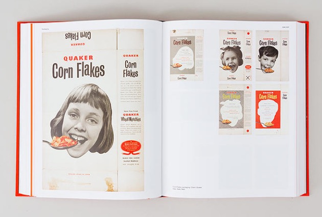
FHK Henrion was a designer who was born in Germany in 1914. He designed a lot of book covers in his time as a designer. He also is known for being the one to design the Quaker Corn Flakes box. 

(Source: fastcodesign.com)


Herb Lubalin

Herb Lubalin is a designer known to be on the team that founded the International Typeface Corporation, or ITC. He mostly deals with and creates different typefaces and fonts that are unique to the logos he makes. 


Tuesday, September 6, 2016

The Beauty of the Airline Baggage Tag reading summary


The Beauty of the Airline Baggage Tag was centered around the luggage tag put on bags when people are flying from one location to another. The amount of people who use airplanes to travel has been going up every year. With so many people flying every day, there is a small percentage of people who get to their destination and their bag is not waiting for them when they get there. The luggage tag is helpful in many different situations. One of the ways it has been a big help is it gives the weight of the bag which is an important thing for workers who are loading the airplane to know when loading bags on the plane. The tags them self have to be strong and have to stand up to things like weather or heat, as well as the ability to not rip easily. The tags used now a days are very flexible, which is one of the key aspects of the luggage tag. They also have to be inexpensive and disposable. The design of the tag needs to be easy to read for the workers. There also needs to be a lot of important information on the tag, information like a barcode, name, flight details, and destination. The luggage tag has improved throughout the years and is set to get more improvement to it, that will help the day to day travel a lot easier and safer for the passengers bags.  

Everything and Nothing Channel Design

The YouTube Channel design and logo I made for my friend Alex Lorenzo's new YouTube channel Everything and Nothing 

Go check out his videos and subscribe!


Squirrel Designs [Work in Progress]

Working on a project involving Squirrels and wanted to post a few of my favorite refined sketches:


Character Characteristics / Letter Fountain Reading Response [VISC 202]

What is another name for Uppercase Letters? 
-Capitals or Majuscule 

What is another word for Lowercase Letters? 
-Minuscule

What is the difference between Font and Typeface? 
-Typeface is upper and lowercase letters of a given design while Font is the formal term that includes all upper and lowercase letter forms 

Where do we see the first example of Roman Capitals? 
-Construction of the letters on Trajan’s Column in Rome

What are the 14 Square shaped letters in our alphabet? 
-A, C, D, G, H, K, N, O, Q, T, V, X, Y, Z

What is the difference between italic and oblique?
-Oblique is font that has been skewed and Italic is separately designed typeface

What is a type family, give examples. 
-Complete set of related typefaces having identical design characteristics
-Times New Roman, Helvetica

What letters are drawn to be optically corrected and why are they corrected optically?
-E, O, A, V
-They have the components in the other letters

 What are the first 6 - 9 letters drawn when creating a typeface?
-n, b, o, v
-A,H,O

 What word do type designers use to test a typeface they are drawing/creating?
-Hamburgefonstiv

 Why are those letters used?
-The letters in the word have basic shapes used in all the other letters

Explain the history of measuring type.
-They would measure it by how each part connects

 What are points and picas?
-Points: measurement used in print
-Picas: Fixed horizontal measurements


How many points are in an inch? 
-72 points

How many picas?
-6 picas

 What is an em?
-unit for measuring width of printed matter

 What is an en? 
-Half of an em

Define wordspace, kerning, and leading.
-Wordspace: the space between the words
-Kerning: adjusting space between letters
-Leading: space between lines

 Name at least 6 pairs of letters that need to be kerned and why.
-Av, Aw, Ay, Ta, Te, To

 What is a ligature? 
-Set of two or more characters that have been designed into a harmonious set

What are the 3 kinds of type alignment? 
-Center, Right, Left

What do we "hang" in typography? 
-Punctuation

What are lining figures? 
-Numbers within a particular font that match the cap height of the uppercase letters

When do you always want to use aligning figures (numbers).
-When you are working with the number alignments

What are old style / non-aligning figures? 
-Have varying heights and alignments

Name a few fonts with non-aligning figures. 
-Basset, Bodini

When do you use non-aligning figures?
-When you’re working with certain numbers